Rob Cortez
Skills
- Disaster Recovery & HA
- Infrastructure as Code
- DNS
- Firewalls
- Load Balancing
- Microservices
- RESTful APIs
- GraphQL
- SaaS/PaaS/IaaS
- Linux
- Python
- Git
- Bash
- Go
- NodeJS
- Javascript
- Vagrant
Creations
A collection of random, somewhat useful things that I have created over the years
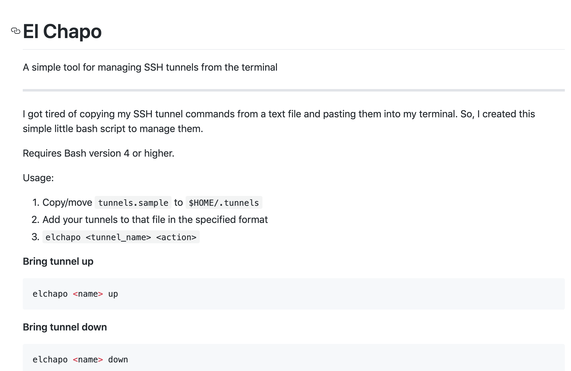
El Chapo
DASDL
Tool to easily download all of the Destroy All Software screencasts for offline viewing.
Blank New Tab
Chrome extension that allows you to have about:blank as your new tab page
Experience
Site Reliability Engineer
Create tooling and automation for observability, resiliency, and overall stability of a large, cloud based SaaS product.
DevOps Engineer
Provisioned infrastructure and developed custom tooling to deliver code efficiently for a cloud based, multi-tenant SaaS product. Created CI/CD pipelines using to both Bamboo and Google Cloud Build to facilitate zero downtime deployments.
System Administrator
Maintained systems and infrastructure residing in both a large on-prem datacenter and remote DR site. Deployed internally developed applications to development and production environments. Estabilished automation to simplify the creation of highly-availble infrastructure in VMWare ESX.
Mobile Software Developer
Developed iOS applications and their supporting backends for clients. Leveraged cloud based services to provide managed data stores and webservices.